Logo Design and Brand Identity
From zero to hero image
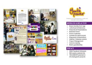
Marketing Communications and Content
Delivering a successful rebrand
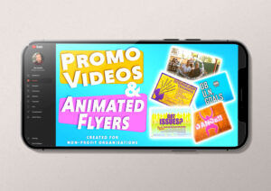
Video and Motion Graphics
Range in motion: from live news content to motion graphics
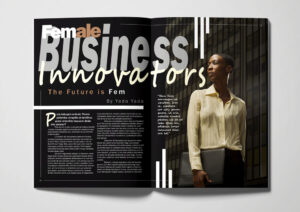
Layout and Typography
Connecting diverse audiences
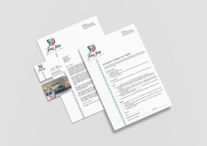
Report Documents
Making professional text readable and fun
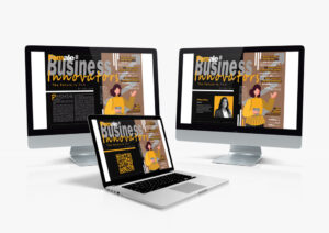
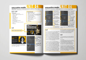
Illustration and Infographics
Adding value with interactive content
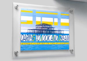
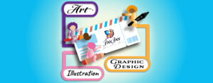
Graphic Art
Developing a fresh visual language and artwork
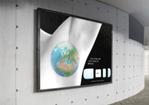
Concept Development
From planetary brief to cosmic mock-up