 FayJay
 Art exhibition catalogue design
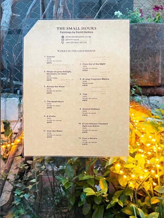
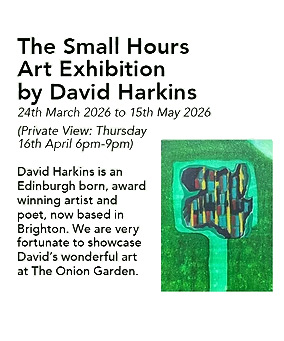
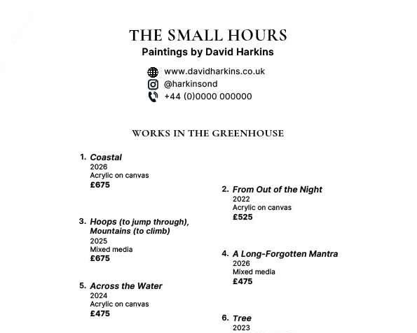
When artist David Harkins prepared to open his new show The Small Hours at The Onion Garden in Victoria, London, he asked me to help design a print‑ready exhibition catalogue price list. There were simply too many lines to fit into a standard Word document while keeping the twelve works from the Greenhouse on one side and the remaining Pavilion works on the other. To handle the layout complexity efficiently—and to achieve the clarity and calm the show deserved—I built the catalogue in Adobe InDesign, a professional publishing application that allows precise control over typography, spacing, and print‑ready output. The result needed to feel contemporary, readable, and unobtrusive, offering visitors clear information whether they arrived for the art or simply for a coffee.
A design brief focused on clarity, care, and visitor experience
A key part of the brief was to reflect the artist’s thoroughness. David wanted visitors—whether they came specifically for the show or discovered it while ordering a flat white—to have access to clear, well‑presented information. Although this wasn’t an exhibition in the conventional sense, attention to detail in delivering all that an interested visitor may want to know was non-negotiable.
My role was to ensure the auxiliary materials conveyed the same level of professionalism and care as the paintings themselves.
The catalogue needed to:
- present all artwork details cleanly
- feel at home in a café‑garden setting
- inform the visitor without intruding
- reflect the artist’s intention to offer a complete experience
- demonstrate a professional approach to document design
- fit on one side!
This is where my technical and creative print-ready document‑design background becomes a pleasure to bring into play.
Choosing the right typefaces for an art exhibition catalogue
Typography sets the tone long before anyone reads a word. For The Small Hours, the artwork titles needed a voice that felt atmospheric and slightly literary. Cormorant Garamond was a natural choice—expressive enough to echo the mood of the paintings, but disciplined enough to stay elegant on the page.
A small but important part of the design brief was following established conventions for presenting artwork information. In professional catalogues and exhibition materials, artwork titles are traditionally italicised to distinguish them from surrounding text and to give them a subtle emphasis without resorting to heavier weights or colours. Using Cormorant Garamond allowed this convention to feel natural and refined; the italics carry a quiet literary quality that suits the tone of The Small Hours.
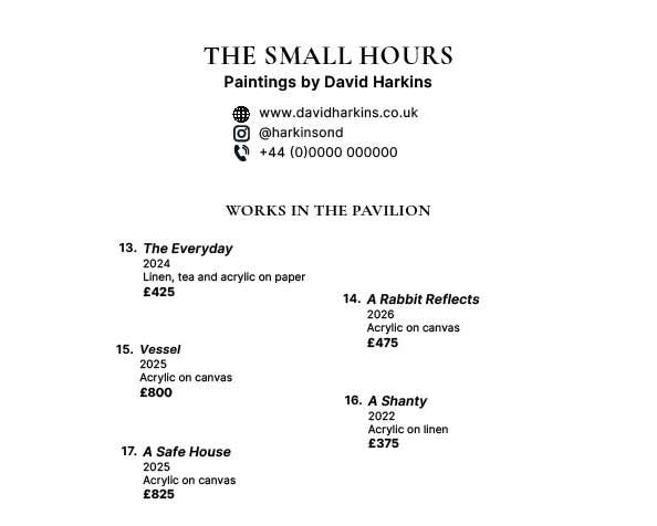
To support the serif, I paired it with Inter, a modern sans‑serif designed for clarity at small sizes. Inter handles the factual elements—years, mediums, prices, and contact details—with a neutrality that keeps the sheet grounded. Using only two typefaces created a clean hierarchy that visitors can absorb at a glance. The serif typeface, styled in ‘all caps’, was used for only the title of the show (the document title also) and the headings to indicate which location within The Onion Garden the set of works on that sheet were displayed.
This approach also reflects the tools I use professionally. I built the catalogue in Adobe InDesign, the same publishing application I use for all of FayJay’s Amazon self‑published book projects. InDesign’s typographic control, styles, and precision make it ideal for producing print‑ready documents where clarity, hierarchy and consistency matter.
Designing a print‑ready layout for an art exhibition
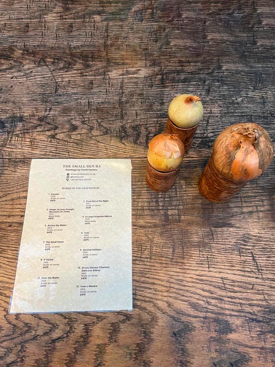
The catalogue was printed on slightly off‑white, lightly textured green‑ivory stock chosen to harmonise with the natural surroundings of The Onion Garden. Because the sheets would be laminated, all text was set in 100% K to ensure crisp reproduction and avoid registration issues. My design credit, design by jeff west · www.fayjayworld.com, was set in Inter at 8 pt and 50% grey to remain discreet.
Designing for print meant paying attention to:
– CMYK‑safe blacks
– small‑size legibility
– line spacing and tracking
– controlled line breaks for long titles
– a hierarchy that works at arm’s length.
Exhibition catalogues often look simple because the complexity has been carefully removed.
Solving the challenge of fitting twelve works on one side
The twin columns of table design
The first side of the sheet, Works in the Greenhouse, contained twelve artworks—far more than a single column could hold without feeling cramped. A tabular, multi‑column layout would have solved the problem mechanically, but it would have introduced visual rigidity and broken the calm tone we wanted.
Instead, I used a gently staggered two‑column flow—not a strict grid, but a layout that allowed each entry to sit with equal visual weight. This created a peaceful left‑to‑right, top‑to‑bottom rhythm and avoided the hard geometry of a table. Long titles were shaped with controlled ragging, ensuring respectful line breaks that kept the text readable and the overall texture of the page balanced.
To support this, I implemented on:
- deliberate line feeds for long titles
- controlled ragging to avoid awkward breaks
- consistent spacing between entries
- a clear number → title → year → medium → price sequence
- subtle typographic contrast to guide the eye.
This allowed the information to breathe while keeping the layout elegant and readable.
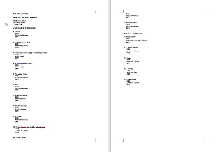
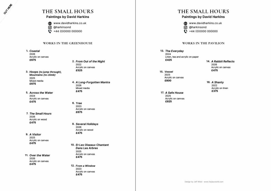
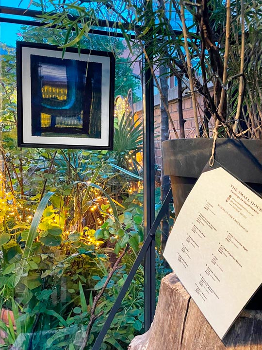
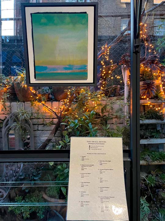
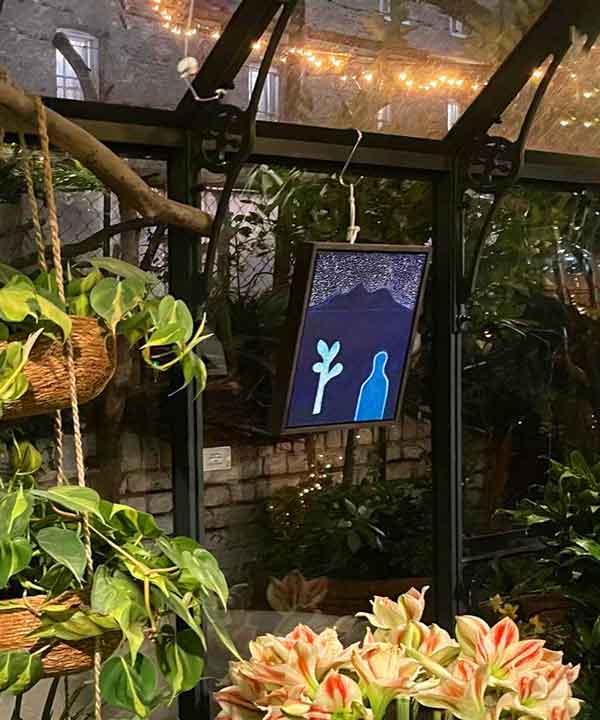
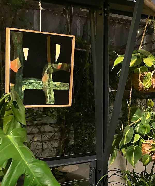
The real estate documenting the works, 1–12 on side 1 (the Greenhouse) and 13–17 on side 2 (the Pavilion), raised a further design decision: how to use the additional space available on the reverse, verso, side. I experimented with allowing the body content to expand into that space, but it broke the visual flow from the title and header elements and introduced an awkward leap. As both sides needed to feel like a “front”—each displayed independently in its respective location—I kept the location title and the position of each artwork number identical. This conveyed equal importance for both venues and clearly informed the viewer how many works were located in each space.
Finessing the contact details
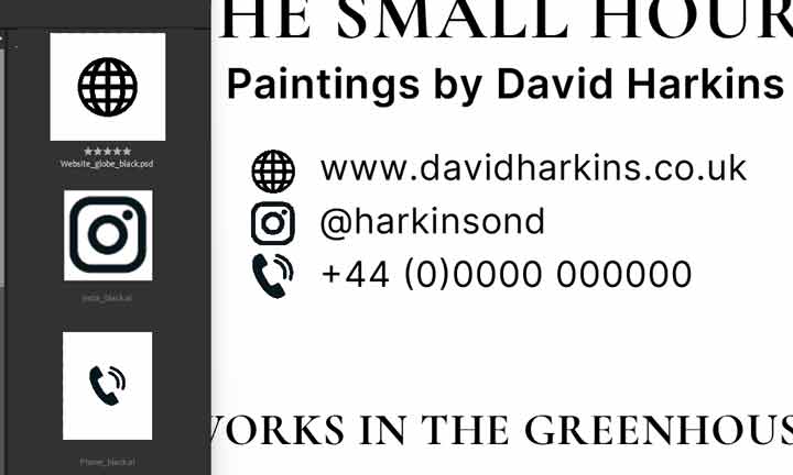
The contact block needed to feel contemporary and instantly recognisable, but still subtle enough not to intrude on the calm tone of the catalogue. I created a small set of cohesive icons—a globe, an Instagram mark, and a telephone symbol—and refined them in Illustrator and Photoshop so their proportions, line weight and visual presence sat comfortably within the typographic system. Using icons rather than plain text reflects modern reader expectations, but keeping them understated ensured they supported the design rather than shouting over it. These icons were designed to harmonise with the typographic system rather than introduce a competing visual language.
Although the show is an augmentation to the existing ambiance of The Onion Garden, the opportunity for a visitor to acquire a unique original artwork—and for the artist to be rewarded for their work—should never be impeded. Clear, elegant contact details were therefore an essential part of the document, enabling visitors to follow up easily without disrupting the visual quietness of the sheet.
Creating a clear item description with only one typeface
Each artwork description used only the sans-serif Inter typeface, however the font character styling enabled subtle emphasis and convention to be applied whilst keeping the design clean and clear.
1. Number (Inter, SemiBold, 11pt)
2. Artwork title (Inter, SemiBold Italic, 11pt)
3. Year (Inter, Regular, 10pt)
4. Medium (Inter, Regular, 10pt)
5. Price (Inter, Bold, 11pt)
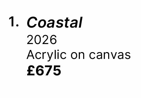
The work’s number and title were bolded, the title following the convention of being italicised. The price was also bolded—this information carrying some importance. The year and medium used a slightly smaller font size and were rendered with the Regular style.
This structure helps visitors skim naturally—essential in a space where people may be browsing casually rather than studying a wall label.
Designing for durability: lamination, hanging, and environmental considerations
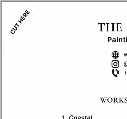
Because the show is displayed in a café‑garden setting, the printed materials needed to withstand handling, moisture, and the general ebb and flow of a busy space. To make the catalogue both durable and visible, I laminated each sheet and punched a single hole in the top‑left corner so it could hang neatly within the venue.
The document includes a small “CUT HERE” guide—a trimming mark I added so I could remove the corner cleanly, preventing moisture from creeping into the paper beneath the laminate. These finishing touches ensured the list felt integrated with the environment: protected, practical, and quietly elegant.
Bringing professional document design into creative projects
Although this catalogue was created for an art show rather than a corporate environment, it still drew on the full breadth of my professional background in document design, both technical and creative. I enjoy weaving those skills into projects like this—where clarity, hierarchy, and print‑ready precision matter just as much as atmosphere and tone.
Thoughtful document design can guide the reader gently, helping them move through the gallery—or through the café—with a sense that the exhibition is integrated into the space rather than imposed upon it.
A last look at the project
Designing the printed materials for The Small Hours was an exercise in restraint: choosing typefaces that support rather than compete, solving layout challenges without resorting to heavy structure, and ensuring every detail—from line breaks to lamination—contributed to a calm, readable whole. The aim was always to let the catalogue sit quietly beside the artwork, doing its job without drawing attention to itself, while enhancing the visitor’s experience in a warm, unconventional setting.
If you can’t make it to The Onion Garden to see The Small Hours in person, you can explore more of David’s work at www.davidharkins.co.uk, where you may well find something very much to your taste, to show in your own setting.
Update: It’s sad to note that The Onion Garden, the setting that gave The Small Hours its distinctive calm, has now closed. In David Harkins’ words, it was “a wonderful oasis amongst the concrete in Victoria,” created by a visionary team whose tenancy has been brought to an abrupt end. There is every hope it will re‑emerge elsewhere — long live The Onion Garden!


